YEAR · 2023
squarciasacchi wines
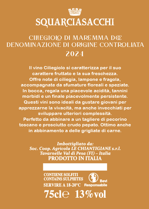
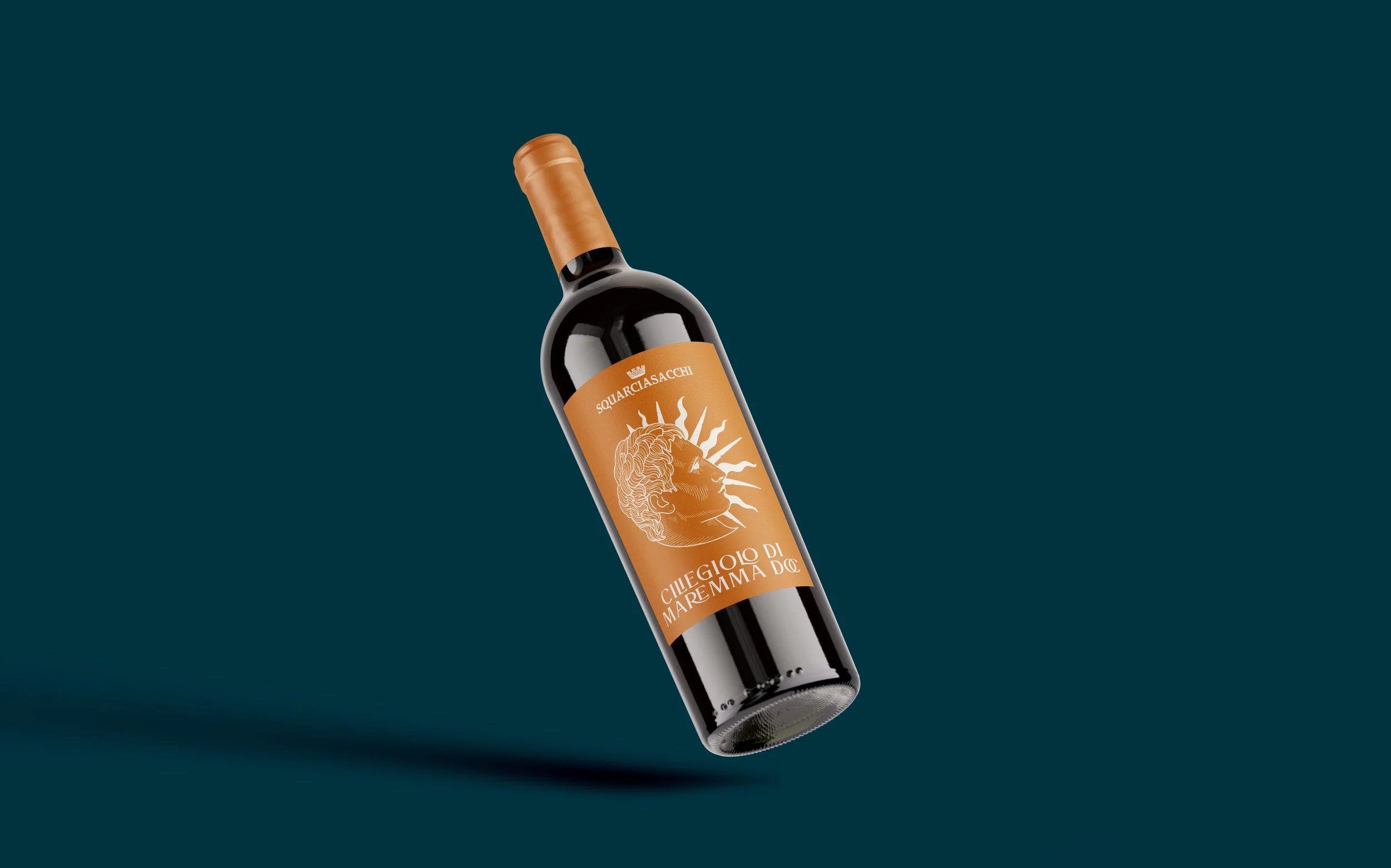
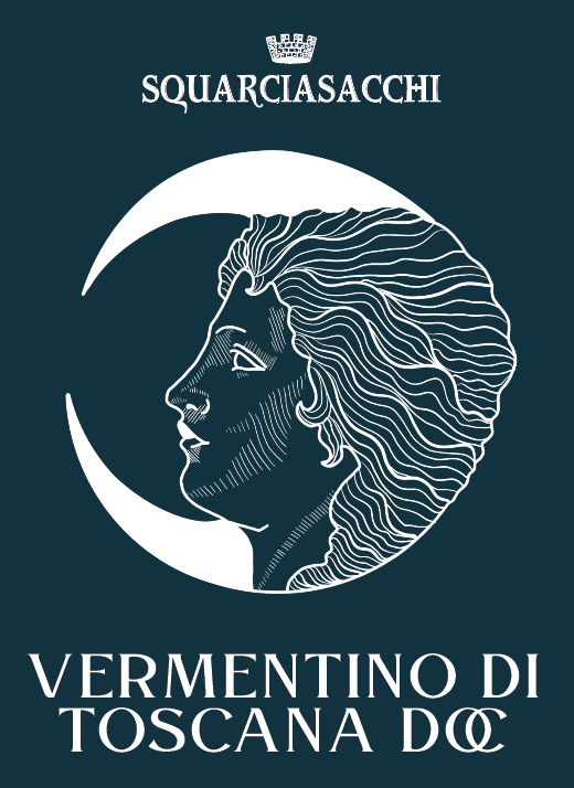
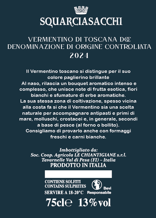
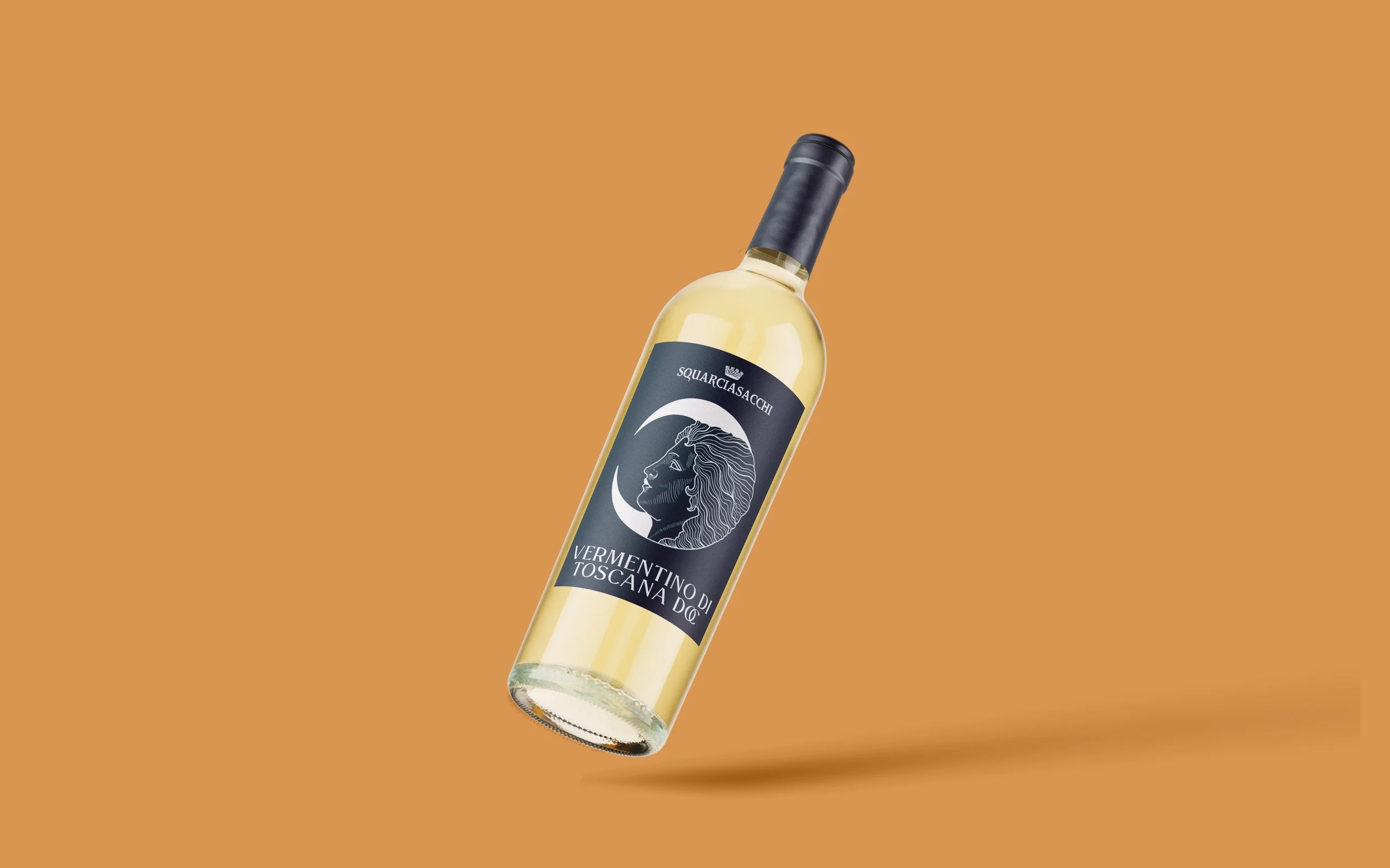
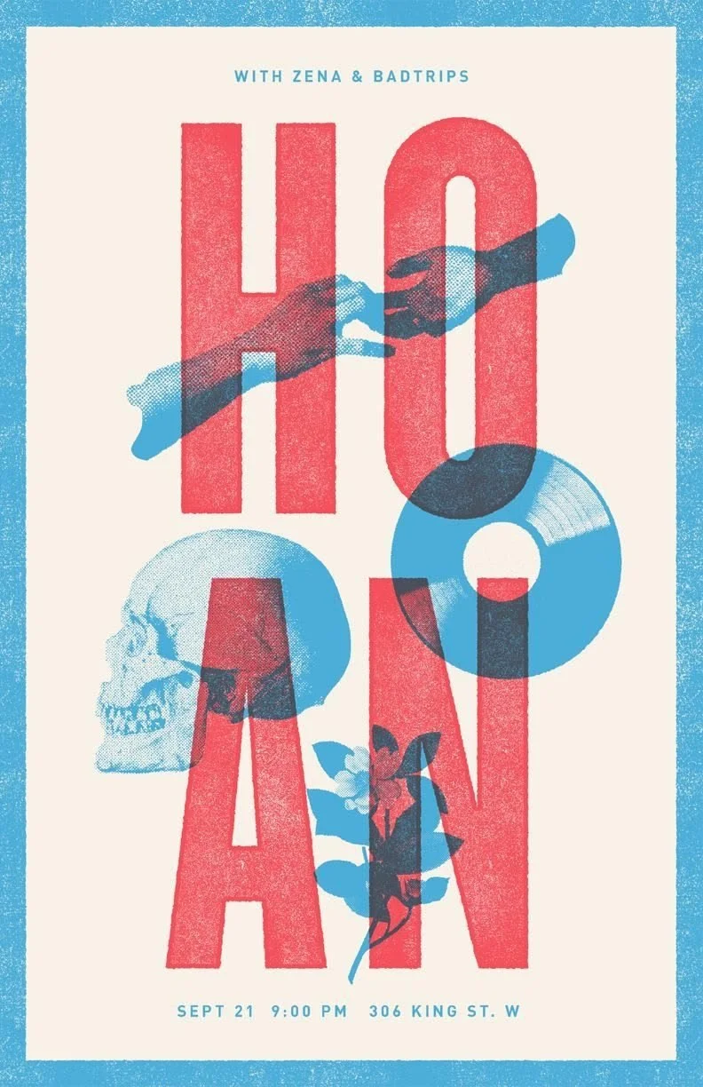
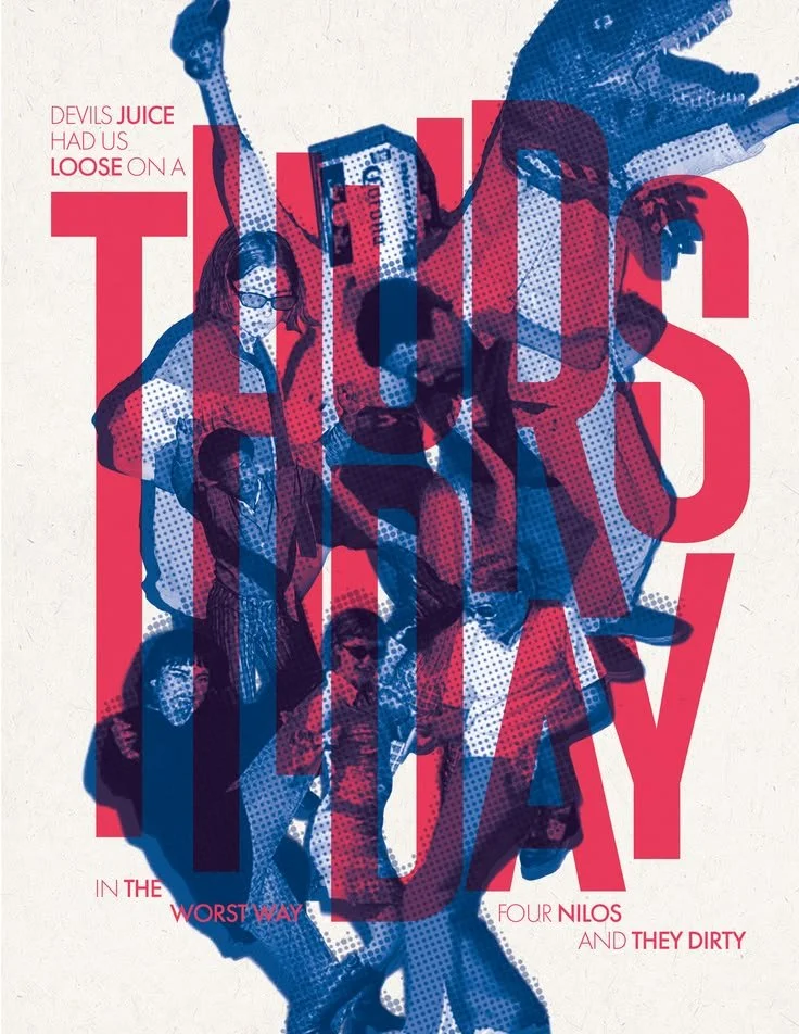
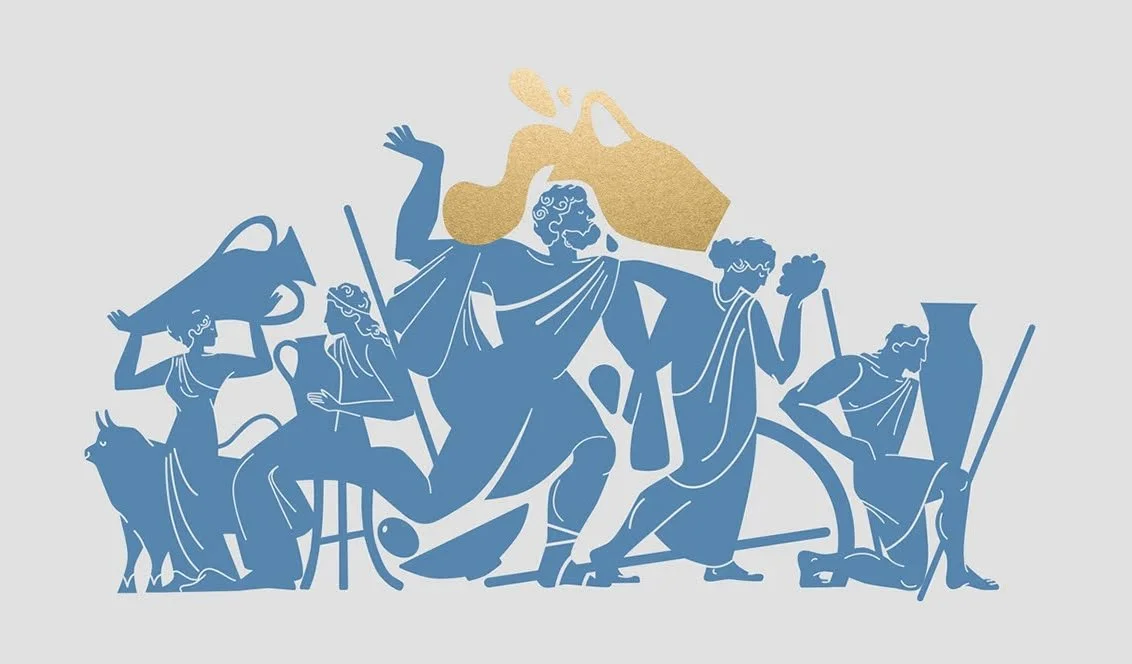
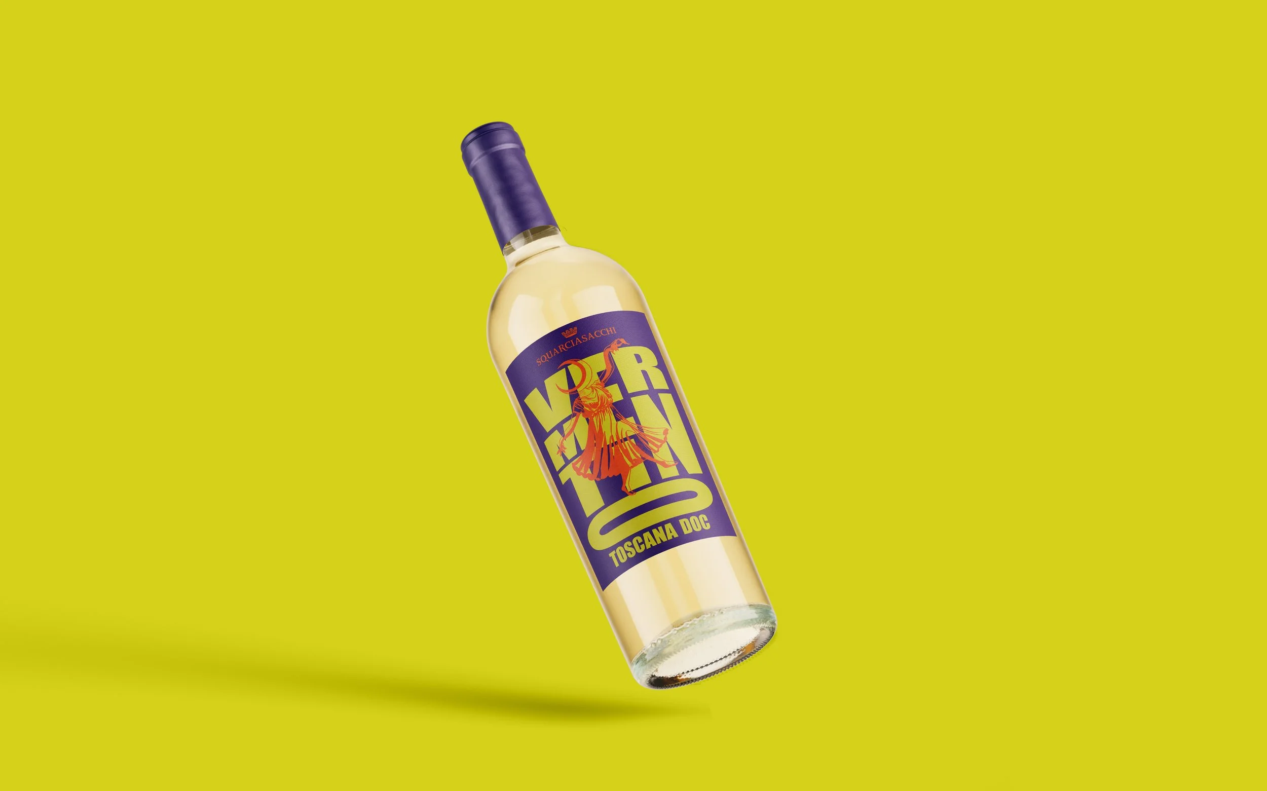
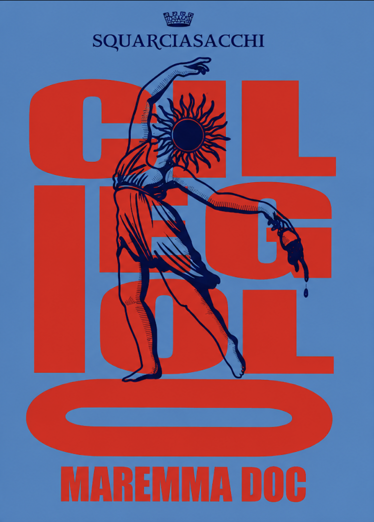
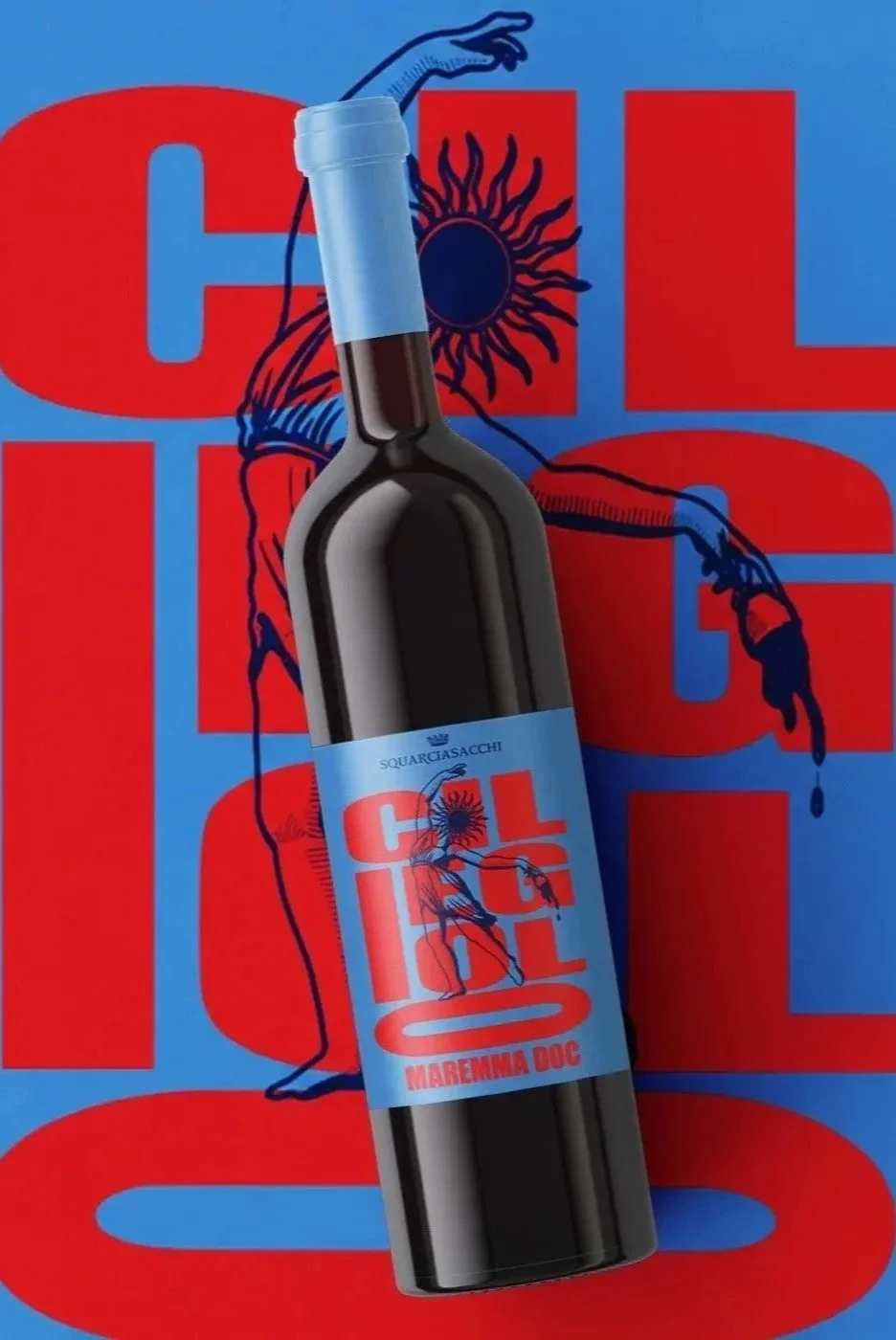
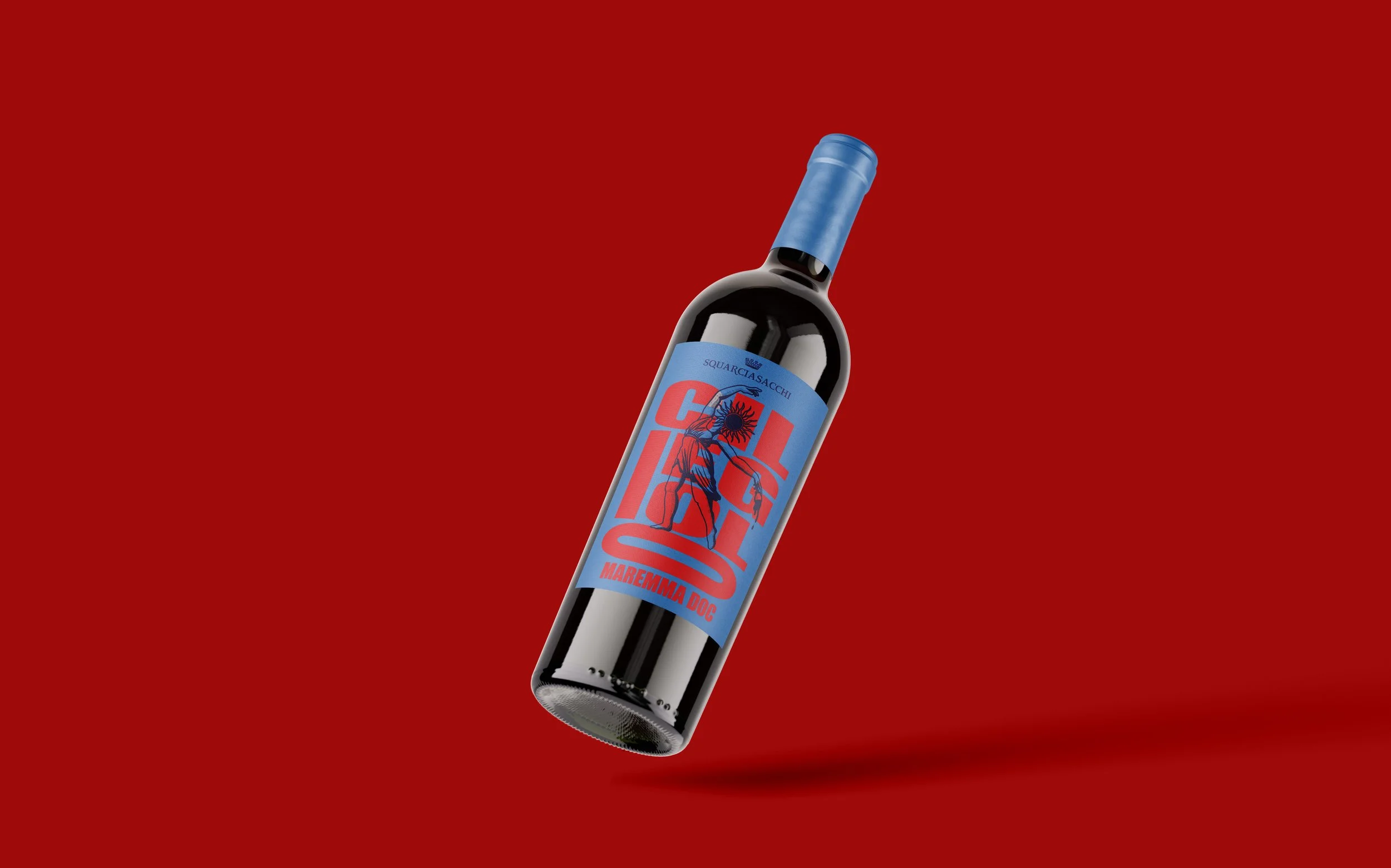
This project explores two distinct creative directions developed for the Squarciasacchi wine labels, conceived as proposals for a university design competition. I chose to develop two different concepts, each born from the same visual roots: the timeless beauty of antiquity, the identity of wine, and a palette of intense, expressive colours. Though different in character, both seek to transform the label into a small visual story: something that catches the eye, evokes a feeling, and gives the wine its own voice.
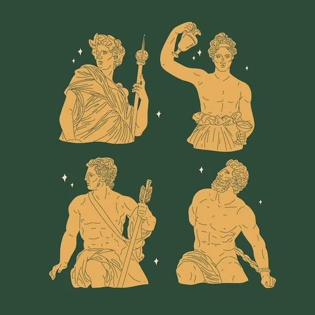
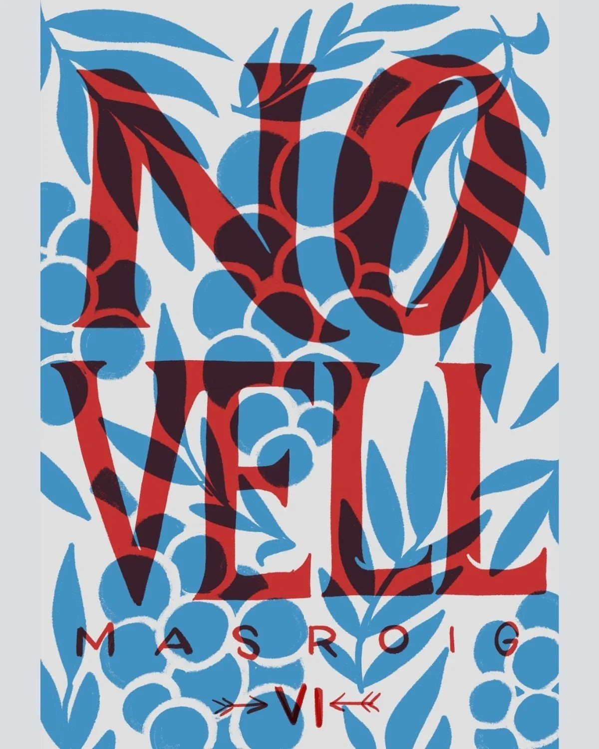
CREATIVE DIRECTION AND MOODBOARD:
✶
✶
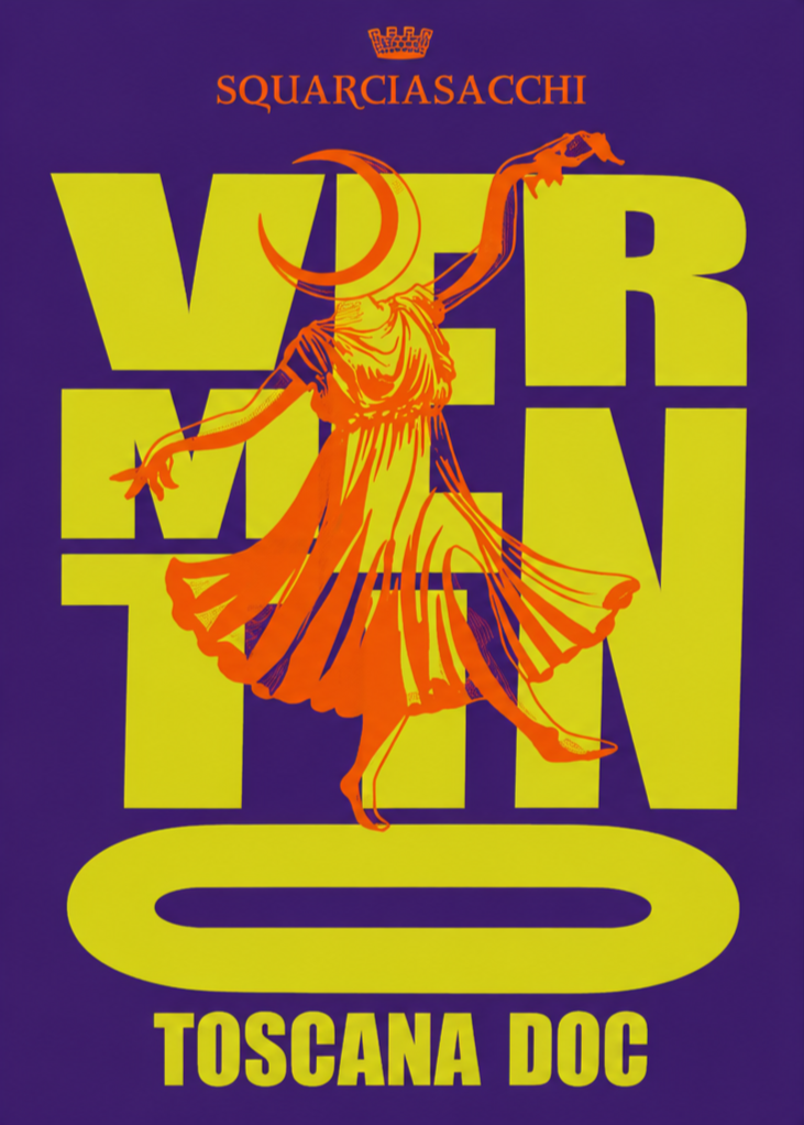
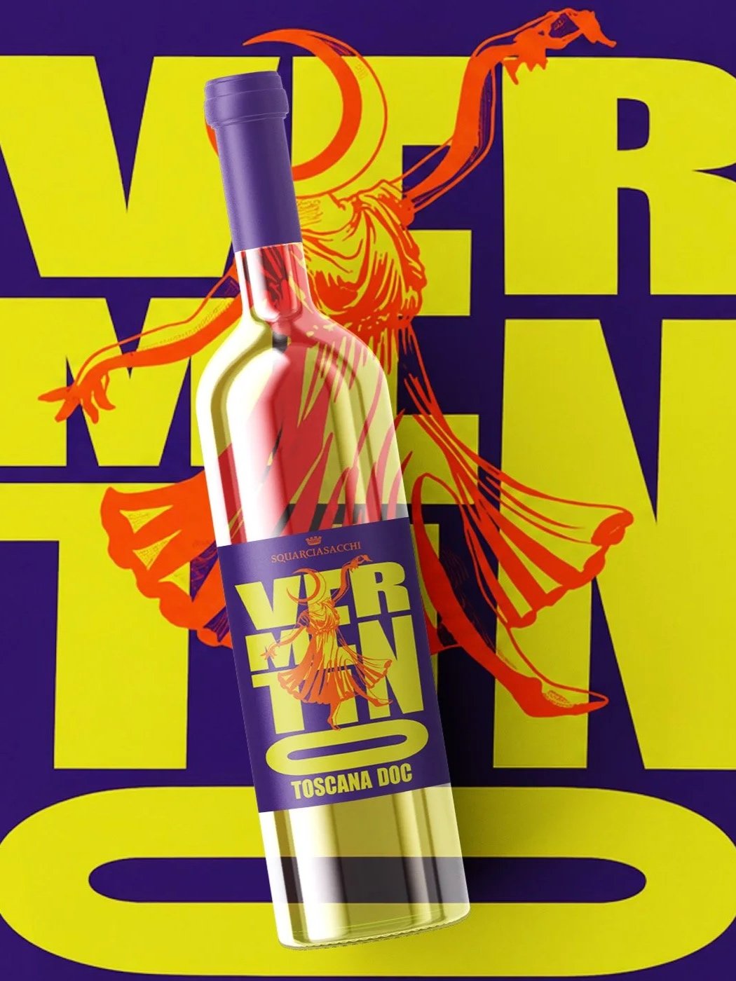
The first concept is playful and vibrant, designed to stand out immediately on the shelves. Bold colours, lively compositions, and a sense of movement create an energetic visual language that feels contemporary while still drawing inspiration from the past. The label becomes a celebration of colour and character, unexpected and joyful, inviting the viewer to stop, look closer, and discover the story behind the bottle.
✶
✶
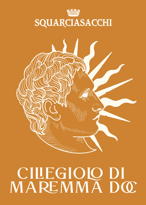
The second concept takes a more classical and romantic direction, embracing softer harmonies and a timeless aesthetic. Inspired by the elegance of ancient imagery and the poetic nature of wine, it creates a quieter, more intimate atmosphere. Delicate details, rich tones, and a sense of nostalgia give the label an almost dreamlike quality, as if a fragment of the past had been preserved on paper, waiting to be rediscovered.